
The College Football Playoff has entered a new era with a fresh visual identity that aims to redefine how fans see the sport’s ultimate stage. The announcement from Irving Texas revealed a carefully enhanced logo system built to carry the CFP’s story into its second decade. This is not just an aesthetic update but a moment of evolution that signals how deeply the playoff understands its place in the modern sports landscape.
CFP Unveils Refreshed Brand Identity and Logo System
From its inception the CFP has represented the highest level of college football competition. The drama the pageantry and the unmistakable energy that fills each playoff game have become defining elements of the sport itself. The new look celebrates that power and emotion while positioning the brand to feel more connected energetic and modern across every platform from stadium screens to digital feeds.
A Gold Standard Reimagined
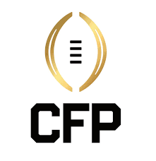
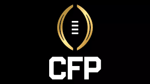
The centerpiece of the redesign is Championship Gold a shimmering metallic gradient applied to the familiar CFP football. Rich Clark the executive director described it as an enhancement that reflects excellence and the pursuit of glory. It is meant to capture the shine of a championship moment the radiance of confetti under the lights and the feeling of triumph that every player dreams about.
The logo’s shape carries subtle updates that together make a striking impact. Bracket lines are thicker ends are rounded and the inset narrowed to mirror the curvature of the national championship trophy. Even the football’s laces now flow more smoothly creating movement and consistency throughout the design. It feels renewed yet familiar a perfect visual metaphor for a playoff system that honors its traditions while embracing the future.
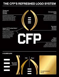
Another key evolution is the integration of the acronym CFP into the main logo. Fans and media alike have used the letters for years to speak about the playoff so the addition feels natural and bold. The CFP wordmark now stands beside the iconic football creating unity and strength in the design. The chosen typeface Video brings sharpness and clarity giving the logo its modern personality and digital versatility.
Every line of this redesign carries intention. The look manages to feel timeless but current powerful yet elegant built to represent the energy of championship moments and the legacy that continues to grow each season.
The Unified Road to the Championship
The updated brand does not stop with the logo itself. The CFP also introduced new bowl lock ups connecting the six playoff-affiliated bowls more closely with the central CFP identity. These visual ties turn each bowl into a chapter within the championship journey linking tradition to progress in one cohesive presentation.
Fans will notice this unity across graphics and broadcasts beginning in the 2026–27 season. The six bowls play key roles in leading teams toward the playoff so aligning their symbols and imagery reinforces the shared mission that defines college football’s grandest stage. The move is both creative and strategic ensuring the playoff feels more interconnected than ever before.
It is a natural moment of growth for an organization that has constantly evolved since its launch in 2014. Twelve years later the CFP stands as a cornerstone of the sport a gateway to glory that every program dreams of reaching. Now with its new gold-accented mark and unified visual identity the playoff looks ready to meet a brand new age of competition storytelling and spectacle.
In college football moments matter legacies matter and presentation matters. The College Football Playoff’s refreshed look embodies all three showing the world that the pursuit of greatness is as much about how it feels as how it looks.